Is Your Monitor Slowing Your Creative Workflow?
Do monitors affect creative workflow speed? Yes, but probably not for the reasons most people assume. A bigger screen won't magically turn you into a faster artist or editor.
What a monitor actually does is remove small frictions that quietly eat your time all day. It can make text sharp enough to read instantly, or force you to squint and zoom. It can show your entire timeline at once, or hide half of it offscreen.
Over a full workday, that difference adds up.
We dug through manufacturer specs, aggregated user reviews, and ergonomic research across design, video, and photography fields. The pattern is consistent. Screen size, resolution, color handling, and posture all feed directly into how quickly you work.
The right display doesn't make you more talented. It just stops getting in your way.
Quick Answer: Yes, but Probably Not the Way You Think
Yes, monitors affect creative workflow speed. Resolution and screen size control how much you see. Color accuracy reduces revision cycles.
Ergonomics prevent fatigue. Most creative slowdowns come from display friction. A well-matched monitor removes pauses.
That makes you faster without changing your skill.
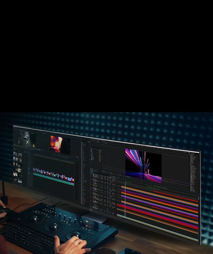
Image source: Bing (Web (fair-use with source credit))
The real speed gain comes from fewer pauses. Every time you zoom in to check a detail, you lose focus. Every time you scroll to find a layer, you lose a second.
Every time you second-guess a color that looked different on your screen, you lose minutes.
As of 2026, even mid-range monitors fix most of these bottlenecks. The tricky part is knowing which features actually matter for your specific workflow. That's what the next sections break down.
How to Tell If Your Monitor Is Slowing You Down
Before upgrading, figure out whether your current display is the problem. Some slowdowns come from hardware that no monitor can fix. Others are direct symptoms of a mismatched screen.
You're probably losing time to your monitor if you notice these patterns:
- You zoom in and out constantly. If you're always hitting Ctrl+Plus or pinching to see details, your resolution is too low.
- You drag windows into place over and over. When your screen can't fit two documents side by side, you end up arranging, not working.
- You lean toward the screen. Moving closer to read text means your pixel density is too low or your viewing distance is wrong.
- You second-guess colors between devices. A photo looks warm on your monitor and cool on your phone. That mismatch costs you client revisions.
- Your eyes or neck feel tired within a couple of hours. Discomfort is a workflow killer because it cuts your productive hours short.

Image source: Bing (Web (fair-use with source credit))
If any of those sound familiar, your monitor is a genuine bottleneck. Each symptom has a specific fix. You don't need a top-of-the-line studio display to solve it.
You just need the right feature aimed at the right problem.
If you're on a laptop, you might be fighting a small screen without realizing it. A decent portable display option can be a cheap first step. For most desk work, a full-size monitor is the better move.
The Real Speed Factors: Resolution, Screen Space, Refresh Rate, Color, Ergonomics
Not all monitor specs matter equally for creative speed. Some are marketing numbers that look great on a box but don't change how you work. Others quietly affect every single task you do.
Resolution and Pixel Density (PPI): Where Speed Actually Comes From
Resolution determines how much content fits on your screen. Pixel density, measured in pixels per inch (PPI), determines how sharp that content looks. Both matter, but in different ways.
A 27-inch 1440p monitor at roughly 109 PPI is comfortable for most creative work. Text is crisp, UI elements aren't huge, and you can fit a decent amount of canvas on screen. A 27-inch 4K monitor at roughly 163 PPI looks noticeably sharper.
You can inspect a 4K photo at 100% zoom and still have room for tool panels.
The hidden speed killer with low PPI is scaling. On Windows, a 1080p monitor forces you to choose between tiny text and oversized interface elements. On macOS, low-density screens look soft and make fine details harder to judge.
If you're constantly zooming in and out, resolution is your problem. Upgrading from 1080p to 1440p at the same screen size is often the single biggest speed improvement you can make.
Refresh Rate and Motion Clarity: When It Helps, When It's Hype
Refresh rate measures how many times per second your screen updates. A 60Hz display updates 60 times per second. A 144Hz display updates 144 times.
For creative work, high refresh rates matter less than most people think. You're not tracking fast-moving enemies in a shooter. You're reading, dragging layers, and scrubbing timelines.
A 60Hz panel handles all of that fine.
Where refresh rate does help is smooth scrolling and timeline scrubbing. At 120Hz or 144Hz, scrolling through a long document feels fluid instead of choppy. You can visually track content as it moves, which reduces eye strain on long review sessions.
For video editors reviewing 60fps footage, a higher refresh rate shows motion more accurately. For everyone else, spend your budget on resolution and color accuracy first.
Color Accuracy (Delta E) and Gamut: Fixing Revisions Before They Happen
Off-color screens are one of the most expensive monitor problems you can have. Not because the monitor itself costs more, but because every wrong color judgment leads to do-overs.
Color accuracy is measured with Delta E, which is the difference between what a screen shows and what it should show. A Delta E under 2 is considered accurate. Under 1 is excellent.
Cheap monitors often ship with Delta E values of 5 or higher, which is visibly wrong.
Color gamut matters too. It defines how many colors the display can produce. sRGB is the baseline for web work. Adobe RGB covers more range for print.
DCI-P3 is the standard for video and digital cinema. If your monitor covers at least 95% of sRGB, it's workable for most tasks. For serious photo editing, look for DCI-P3 or Adobe RGB coverage above 90%.
The practical speed benefit is simple. If your screen shows accurate colors from the start, you spend zero time correcting mistakes that were never there. The International Color Consortium (ICC) maintains the color profile standards that make this possible.
You can check their documentation at color.org if you want the technical details.
Ergonomics and Eye Strain: The Silent Productivity Killer
A monitor that's too low, too far, or too bright physically slows you down. Eye strain makes you blink less, squint more, and lose focus. Neck pain pulls your attention away from your work entirely.
The basic setup is easy to get right. Your eyes should hit the top third of the screen when you look straight ahead. The screen should be roughly an arm's length away.
The top of the display should sit at or slightly below eye level.
Brightness matters more than most people realize. A screen that's brighter than the room around it makes your pupils work harder. Flicker-free backlights and low blue light modes reduce strain during late sessions.
TÜV Rheinland's Eye Comfort certification is one marker to look for when comparing models.
A comfortable monitor doesn't make you faster in one dramatic way. It just keeps your brain from being interrupted by physical discomfort every few minutes. Over a full workday, that's a meaningful amount of saved attention.
Match Your Workflow: What Kind of Creative Are You?
The "best" monitor depends entirely on what you do all day. A video editor and a writer need completely different displays. Here's a quick breakdown of what each creative workflow actually needs.
| Workflow | The Main Bottleneck | Display Priority | Ideal Setup |
|---|---|---|---|
| Video editing | Timeline scrolling and clip review | Screen space, motion clarity | 34-inch ultrawide or 32-inch 4K |
| Photography | Detail inspection and color judgment | Pixel density, color accuracy | 27-inch 4K with high PPI |
| Graphic design | Canvas space and reference placement | Resolution, aspect ratio | 27-inch 4K or dual 1440p |
| UI/UX design | Multi-window work and prototype review | Screen real estate, text sharpness | Dual 27-inch 1440p |
| Writing and coding | Text readability and side-by-side docs | Pixel density, eye comfort | 27-inch 1440p or 4K |
Video Editing: Timeline Real Estate and Smooth Scrolling
Video editors live on the timeline. The more clips, tracks, and keyframes you can see at once, the less time you spend scrolling. Width matters more than height for this workflow, which is where ultrawide displays shine.
A 34-inch ultrawide monitor fits a full timeline plus your preview panel and audio meters on one screen. You can see where clips end and begin without zooming out to 10% scale. The bezel-free single display also beats a dual setup because clips can cross the center without interruption.
If you're on a laptop, you'll especially benefit from a bigger external screen. Pair it with a work-from-home laptop pick and you'll have a much smoother editing experience.
Photography: Sharpness, Zoom Fatigue, and Client Proofs
Photographers need to see fine detail at 100% zoom. If you're constantly zooming in and out to check sharpness, noise, or skin texture, pixel density is your most important spec.
A 27-inch 4K monitor shows a 24-megapixel photo at roughly full-screen without reducing your zoom level. At 1440p, you'd need to zoom in more often to confirm focus. At 1080p, checking sharpness becomes painful.
Color accuracy also matters for photo work, especially if you deliver client proofs. A monitor with factory calibration and 100% sRGB coverage saves you from sending off images that look wrong on other screens.
Graphic Design and UI/UX: Canvas Space and Reference Placement
Graphic designers and UI/UX professionals constantly juggle multiple windows. The design file, a reference image, a pattern library, and a preview panel all need to be visible simultaneously. That makes screen real estate the top priority.
Two 1440p monitors work well here. You can keep the canvas on one screen and your references on the other. If you prefer a single display, a 32-inch 4K panel gives you enough width to split into two effective zones.
One specific speed boost for this workflow is window management software. Tools like FancyZones on Windows or Magnet on macOS turn a large display into a predictable grid. You can snap windows into place with a keyboard shortcut instead of dragging each time.
Writing and Coding: Text Sharpness and Multi-Window Flow
Writers and developers get the least glamorous monitor advice. Prioritize sharp text. Reading fuzzy type for hours is draining, and it makes reviewing long documents slower than it should be.
A 27-inch 1440p monitor at standard scaling is the sweet spot for most people. Text looks clean, UI elements are readable, and you can fit two documents side by side without them feeling cramped. For coding, vertical space is valuable.
A 16:10 panel shows a few extra lines of code.
If you're comparing work and gaming machines too, the same display priorities apply to a work-and-gaming laptop setup.
Dual Monitors vs Single Ultrawide: Which Makes You Faster?
This is the oldest argument in creative work. Two separate screens or one wide panel. Each setup has real tradeoffs that change based on your workflow.
| Factor | Dual Monitors | Single Ultrawide |
|---|---|---|
| Total screen space | Higher with two 27-inch panels | Less total, but more contiguous |
| Moving windows between screens | Drag or use hotkey, hits bezel | Seamless, no bezel interrupt |
| Full-screen one app | Works naturally on one screen | Everything is on one giant screen |
| Desk space | Needs space for two stands | One stand, often curved |
| Price for similar quality | Higher for two good panels | Lower than two good panels |
| Gaming on the same setup | Bezel in the middle hurts | Picks up ultrawide game support |
For most creative work, the bezel is the deciding factor. A single ultrawide lets you place tool panels beside the canvas without any physical break between them. That matters for video editors and 3D artists who need continuous horizontal space.
Dual monitors are better when you want to dedicate one screen full-time to reference material. A photographer can put the gallery view on one display and the full-size catalog on the other. That separation feels natural.
Your best choice depends on how often you work across the full width of your screen. If you mostly keep one app focused, dual monitors win. If you constantly need multiple panels visible, an ultrawide will feel smoother.
One warning: don't try to save money by buying a TV instead of a monitor. A 43-inch TV may seem affordable, but its pixel density is too low for close-up creative work. Input lag can also make cursor movement feel floaty.
If you're shopping on a budget, wait for seasonal display sales and buy a proper monitor instead.
Resolution Showdown: 1080p vs 1440p vs 4K for Creative Work
Resolution directly controls how much you see and how sharp it looks. For creative work, the jump from 1080p to 1440p is the single biggest upgrade you can make. It gives you roughly 78% more pixels than 1080p without requiring expensive scaling tweaks.
| Resolution | Typical Size | Pixel Density (27") | Best For |
|---|---|---|---|
| 1080p | 24"–27" | ~92 PPI | Budget setups, casual use |
| 1440p | 27"–32" | ~109 PPI | Most creative work, best value |
| 4K | 27"–32" | ~163 PPI | Photo editing, high-detail work |
At 1440p, text stays crisp, tool panels fit comfortably, and you won't need heavy Windows scaling. At 4K, you must scale to 125% or 150%, which eats screen space. For pure workflow speed, 1440p on a 27-inch panel is the sweet spot.
Go 4K only if you need to inspect fine details like skin texture or sharpness at 100% zoom.
Does Refresh Rate Matter for Non-Gamers? Probably Less Than You Think
No, you don't need 144Hz for most creative work. A 60Hz display handles reading, dragging layers, and scrubbing previews perfectly fine. The places high refresh rates help are scrolling feel and motion preview.
At 120Hz or 144Hz, scrolling through long documents becomes visibly smoother. Your eyes track the content instead of chasing it. VESA's AdaptiveSync also prevents stutter when your GPU frames don't match the display's refresh.
This matters if you preview animation or prototype motion.
For video editors reviewing 60fps footage, a 120Hz display shows motion more accurately. For everyone else, save your budget for resolution and color accuracy. Those specs make a bigger daily difference than refresh rate ever will.
Setup Mistakes That Quietly Wreck Your Workflow Speed
Most monitor speed problems come from how the display is set up, not the display itself. A few small fixes can save you hours each week.
- Monitor set too low. Your eyes should hit the top third of the screen. Low screens force a forward head posture that causes neck pain and fatigue.
- Wrong scaling on Windows. At 1080p, 100% scaling makes text tiny. At 4K, you need 125% or 150%. Pick the scaling that keeps text readable without shrinking your workspace.
- Glare from windows or overhead lights. Position the screen perpendicular to light sources. Glare kills contrast and makes you squint.
- Cables plugged into the wrong port. Many monitors have HDMI ports that cap at lower refresh rates. Use DisplayPort or USB-C for full bandwidth.
- Refresh rate left at default. Some monitors default to 60Hz even when they support 144Hz. Change it in your system display settings after plugging in.
Fix these one by one. You'll likely notice a bigger speed boost than a monitor upgrade would give you.
Monitor Calibration in Minutes: A Speed Fix Most People Skip
Uncalibrated monitors cause color mismatches that lead to revisions. A quick calibration session prevents that. You don't need expensive gear either.
Windows has a built-in calibration tool. Search for "Calibrate display color" and walk through the steps. macOS has a similar display calibrator in System Settings. Both adjust gamma, brightness, and contrast.
For better accuracy, use a hardware colorimeter like an X-Rite or Datacolor device. These measure your actual screen output and create an ICC profile. The whole process takes about 10 minutes.
You should recalibrate every few months because screens drift over time.
If calibration seems overkill, at least set your monitor to a preset mode like sRGB. Most displays ship with oversaturated "vivid" modes that show colors incorrectly. The sRGB mode is usually much closer to a professional standard.
What to Buy at Different Budgets: A Practical Rundown
You don't need a thousand-dollar display to speed up creative work. Each budget tier gets you a meaningful jump in productivity.
| Price Range | What You Get | Best Choice |
|---|---|---|
| $150–$250 | 24"–27" 1080p or budget 1440p | Entry desk setup |
| $250–$400 | 27" 1440p with good sRGB coverage | Best value for most users |
| $400–$700 | 27" 4K or 34" ultrawide | Photo editors and video producers |
In the entry tier, look for at least 95% sRGB coverage and an IPS panel. Color shifts are unacceptable for creative work, and IPS delivers consistent viewing angles. Avoid TN panels entirely.
The mid tier is where speed really starts. A 27-inch 1440p IPS display with factory calibration is the standard recommendation for good reason. It checks every box for speed: sharp text, solid color, and comfortable screen space.
At the top tier, you're paying for niche needs. A 4K high-PPI display helps photographers judge sharpness. An ultrawide helps video editors see the whole timeline.
Choose the one that solves your specific bottleneck, not the one with the most specs on the box.
Frequently Asked Questions
Can a better monitor make me faster at design work?
Yes, but only if your current screen has limiting specs. A 1440p or 4K display reduces zooming and scrolling. That means fewer interruptions and faster iteration.
If your monitor already handles your workflow comfortably, an upgrade won't magically boost speed.
Is a 4K monitor worth it for photo editing?
Yes, for photographers, 4K is worth it. You can inspect photos at 100% zoom on a 27-inch screen and still keep your tool panels visible. The pixel density of roughly 163 PPI makes fine detail easier to judge.
That cuts down the time you spend zooming in and out to check sharpness.
How important is monitor calibration?
More important than most people realize. An uncalibrated monitor can cause color mismatches, leading to rework and client revisions. A simple calibration session takes about 10 minutes.
Windows and macOS both have built-in tools that get you close enough for most creative work.
Should I buy a gaming monitor for creative work?
Only if it has accurate color. Gaming monitors often prioritize refresh rate over color fidelity. Look for one with at least 95% sRGB coverage and an IPS panel.
If you also play games, a 144Hz IPS display works for both. Otherwise, a standard color-focused monitor is the safer pick.
Why does text look blurry on my new monitor?
Blurry text is usually a scaling problem. On Windows, set your display scaling to 125% or 150% for 4K screens. On macOS, check that you're not forcing a non-native resolution.
Also make sure your cable supports enough bandwidth. HDMI 1.4 caps out at 1080p, so use DisplayPort or USB-C for higher resolutions.
Final Verdict: Upgrade Only When It Fixes a Bottleneck
A monitor is a tool for removing friction. It doesn't make you more creative, but it can stop wasting your time. The best upgrade is the one that directly fixes your biggest pain point.
If you zoom constantly, go higher resolution. If you can't fit two documents on screen, go bigger or wider. If colors look wrong on every device, get a factory-calibrated panel.
If your neck hurts, fix your setup before buying anything.
Start with your posture and scaling settings. Those are free. Then move up to a 27-inch 1440p display as the value sweet spot.
Only jump to 4K or ultrawide if your workflow genuinely demands it.
The fastest creative workflow is one where your screen never makes you think about the screen itself. Find a display that disappears into the work, and your speed will follow.