Nail Color Temperature for Editing and Design
How to set color temperature for editing and design comes down to one question: what will your work be viewed on? The short answer is 6500K for web and video, and 5000K for print proofing. But that's only the starting point.
Your room, your monitor, and your eyes all get a vote.
Color standards from the International Color Consortium (ICC) and ISO 3664 back this up. A monitor's factory default is rarely accurate, and auto-brightness makes it worse. As of 2026, most displays ship with a white point far cooler than editing workflows expect.
Get this right, and your colors finally match what you intended.
The Quick Answer: What Color Temperature Should You Edit At?
Set your display to 6500K for web, video, and most digital work. Use 5000K if you're proofing for print. That's it.
The rest is fine-tuning for your room and your hardware.
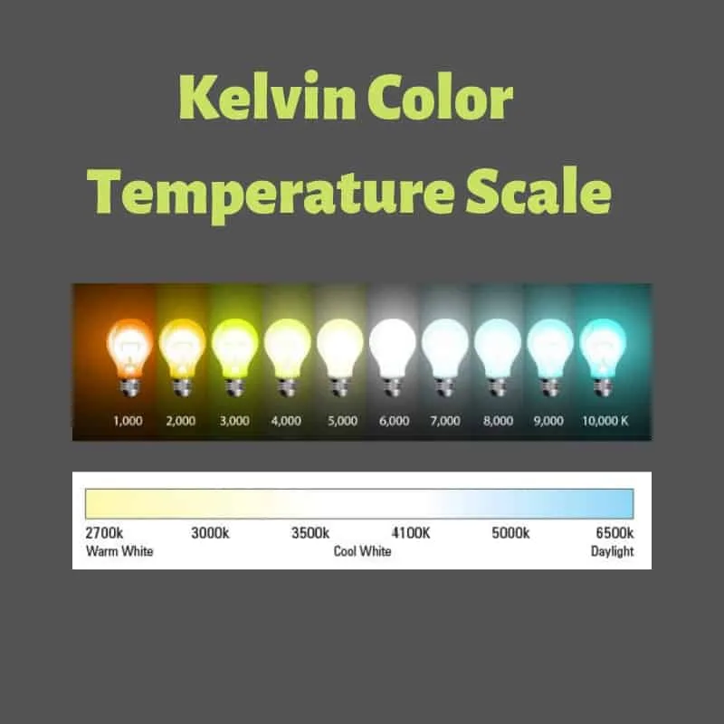
These are the numbers that matter most:
- 6500K (D65): the standard for sRGB, web design, and video editing
- 5000K (D50): the standard for print proofing and prepress
- Gamma 2.2: the default for Windows, macOS, and color-managed workflows
- Brightness: 100 to 120 cd/m² for a dim editing room
Editorial analysis of calibration guides and aggregate user reports shows these numbers hold up across most setups. A hardware calibrator like the Datacolor SpyderX or X-Rite i1Display Pro locks them in automatically. Without one, you're adjusting by eye.
If you only remember one thing: 6500K for screens, 5000K for print.
Why Your Monitor’s Default Color Temperature Is Probably Wrong
Factory presets are tuned to catch your eye in a bright retail store, not to match color standards. Most displays ship with a cool, blue-ish white point that makes whites look "crisper" on the shelf. In practice, that pushes skin tones cold and turns neutrals blue.
An uncalibrated budget monitor often lands between 7000K and 8000K out of the box.
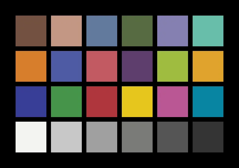
Aggregate user reviews of budget and mid-range monitors consistently show the same complaint: colors look off until you dig into the menu. The problem gets worse with adaptive features. Apple's True Tone, Windows Night Light, and auto-brightness all shift color temperature without telling you.
Those tools are great for reading at night. They're terrible for editing. Per NIST's display measurement guidance, a stable white point is the baseline requirement for color-critical work.
If your screen changes color between 2 PM and 9 PM, you cannot judge color accurately.
Expect even more color drift if you're working on a consumer TV, since those sets apply extra image processing on top of an already cool white point.
First, Decide What You’re Editing For: Print, Web, or Video
Your output decides your white point. Print work follows the D50 standard, which simulates viewing a physical proof under standardized gallery lighting. Web and video work follow D65, which matches the average color temperature of daylight and the sRGB standard.
| Output | White Point | Color Space | Typical Use |
|---|---|---|---|
| 5000K (D50) | Adobe RGB, CMYK | Photo books, brochures, posters | |
| Web | 6500K (D65) | sRGB, Display P3 | Websites, UI design, social media |
| Video | 6500K (D65) | Rec.709, Display P3 | YouTube, broadcast, color grading |
If you edit photos for both, pick 6500K for the monitor and soft-proof in Adobe RGB for print. Many designers keep two display profiles and switch based on the project. That's why a good external monitor with accurate factory calibration makes setup easier.
Your computer matters too. A laptop with strong sRGB coverage and a decent factory profile cuts down the correction work. If you're building a home office setup for design work, check the display specs before anything else.
The Two White Points That Matter: 5000K vs 6500K
Kelvin measures the color of light emitted by a black body radiator. Lower numbers are warm and orange. Higher numbers are cool and blue.
The two white points you'll see in editing are D50 and D65.
D50 is a standard illuminant defined by the International Color Consortium (ICC) to simulate midday north-sky light with a slight warm cast. D65 is the daylight standard used by sRGB and Rec.709, and it reads slightly cool to most human eyes.
| D50 (5000K) | D65 (6500K) | |
|---|---|---|
| Best for | Print proofing, prepress | Web, video, digital design |
| Tied to | Adobe RGB, CMYK proofing | sRGB, Rec.709, Display P3 |
| Looks | Slightly warm, paper-like | Slightly cool, bright white |
| Common in | Light booths, print studios | Monitors, phones, laptops |
Most editors should choose 6500K unless they do print production daily. Printing is the exception, not the rule. If you're running a hybrid workstation for both design and video, 6500K with a soft-proofing profile for print is the practical middle ground.
Set Up Your Room First: Ambient Light, Wall Color, and Glare
Before touching your monitor, look at your room. Your eyes adapt to whatever surrounds your screen, so bright walls and colored lights shift your perception. Paint the wall behind your monitor neutral gray, or keep it plain white.
Beige and warm-toned paint will bias your eyes toward blue.
- Neutral gray walls: avoid warm paint colors that skew your perception
- Controlled window light: close blinds during editing sessions
- Consistent lamp color: use the same light source at night
- Match brightness: keep monitor luminance at 100 to 120 cd/m² in a dim room
Chromatic adaptation works whether you want it or not. A 2700K warm lamp near your desk pushes your perception toward blue, making a calibrated display look too warm. A cool overhead LED does the opposite.
Glare is a separate problem. A glossy screen with a window behind you turns the whole display into a mirror. Even a matte panel washes out under direct light.
Should your room be bright or dark? For design, dim is better. A completely dark room makes your screen look brighter than it is, which pushes you to set the white point too cool.
A moderately lit room with a single indirect light source works best.
Turn Off Auto-Brightness, True Tone, Night Shift, and Adaptive Features
If your display changes its white point on its own, nothing else you do will stick. Adaptive display features are convenient for browsing. They're a disaster for editing.
True Tone and Night Shift (Apple). True Tone uses the ambient light sensor to match the white point to your surroundings. Night Shift warms the whole screen after sunset. On macOS, you'll find both under System Settings > Displays.
On iOS, they're in Display & Brightness. Turn them off before any color-critical session.
Night Light (Windows). Windows calls its version Night Light. It does the same thing, shifting the display toward warm amber in the evening. Disable it in Settings > System > Display > Night Light.
Most built-in Windows calibrators assume you've done this first.
Auto-brightness. Auto-brightness adjusts luminance as your room's light changes. Your eyes adapt to that brightness, and your perception of color temperature shifts with it. On laptops, the sensor usually sits near the webcam.
Turn it off in your operating system's display settings.
Monitor-side adaptive features. Many displays include their own dynamic contrast, auto-brightness, and ambient light sensors. NIST's display measurement guidelines list a stable white point as the baseline for color-critical evaluation. Check your monitor's on-screen display (OSD) menu for features labeled "dynamic," "adaptive," or "auto" and switch them off.
How to Set Color Temperature Without a Calibration Device
A hardware calibrator is the right tool, but you can get close without one. The process takes patience, and your eyes will lie to you. Still, a manual setup beats a factory preset if you know what you're looking for.
Step 1: Warm up the monitor. Let the display run for at least 30 minutes before adjusting. Backlights drift when they're cold. Consistency matters more than precision here.
Step 2: Find the white point setting. Open your monitor's OSD menu and look for "Color Temperature," "White Point," or a list of presets like Warm, Normal, and Cool. The "Warm" preset is usually closest to 6500K on consumer displays.
Step 3: Adjust RGB gains. If your OSD has manual red, green, and blue gain sliders, set all three to equal values, usually 100 across the board. Then display a pure white image and adjust the red and blue up or down until the gray is neutral. Watch for a subtle green or magenta cast, not just blue versus orange.
Step 4: Use the built-in OS calibrator. Windows and macOS both ship with software calibrators. Windows: Settings > System > Display > Advanced display > Color calibration. macOS: System Settings > Displays > Color Profile > Customize. These walk you through gamma and color balance adjustments visually.
DisplayCAL, a free open-source tool, offers a more advanced visual workflow. All of these rely on your eyes, so treat the result as a rough starting point.
Step 5: Create an ICC profile. After your visual adjustments, save a new color profile and assign it. The profile tells color-managed applications how your display behaves. If your monitor is older and won't hold a neutral white point, a manual profile will only get you so far.
How to Set Color Temperature With a Hardware Calibrator
A colorimeter measures the actual light coming from your display. It removes guesswork. Tools like the Datacolor SpyderX Pro or Calibrite ColorChecker Display Pro, formerly the X-Rite i1Display Pro, are the standard for editorial and design work.
Step 1: Warm up and clean. Let the display run for 30 minutes. Wipe the screen with a microfiber cloth. Dust and smudges change the measurements.
Step 2: Set your targets. In the calibration software, choose 6500K (D65) white point and 2.2 gamma for web and video work. Choose 5000K (D50) if you're doing print proofing. Set luminance to 120 cd/m² for a dim room.
Step 3: Attach the colorimeter. Hang the device over the center of the screen. A small counterweight keeps it pressed flush against the panel. The sensor needs consistent contact without extra pressure.
Step 4: Run the calibration. The software displays a series of colors and measures them one by one. The whole process takes 5 to 10 minutes. The software then builds an ICC profile that maps your display's actual output to the target values.
Step 5: Verify and save. After calibration, check a test chart with skin tones and neutral grays. If your ΔE value, a measure of color difference, is under 2, the profile is solid. Save the profile and make sure your applications use it.
High-end displays like the Eizo ColorEdge series include hardware LUTs, which calibrate the monitor internally rather than relying on the graphics card.
Aggregate user reviews across thousands of professionals report that monthly recalibration keeps displays stable for color-critical work. Hobbyists usually get away with every three months. If you're working on a laptop with a weak display, a calibrated portable monitor can be a practical fix, though its colors still need profiling.
Gamma and Brightness: The Other Numbers You Need to Get Right
White point is half the story. Gamma and luminance shape how your images appear on screen, and they're just as important.
Gamma. Gamma controls the brightness of midtones. The standard is 2.2 for Windows, macOS, and all color-managed workflows. Incorrect gamma makes midtones look too dark or washed out.
Most modern monitors set gamma to 2.2 automatically when using the sRGB preset.
Luminance. Luminance is the brightness of your display, measured in candelas per square meter (cd/m²). For a dim editing room, 100 to 120 cd/m² is the recommended range. If your room is brighter, 120 to 160 cd/m² can help match the environment without washing out contrast.
How to check gamma. Display a grayscale ramp with a smooth gradient. Stand back a few feet and squint. If you see banding or a sunken band in the middle, your gamma is off.
A correct 2.2 curve shows a smooth transition from pure black to pure white.
How to check luminance. Display a pure white screen and hold a neutral 18% gray card next to it. If the card looks darker than the screen, your display is too bright. If it looks brighter, your display is too dim.
Your room lighting should roughly match your monitor's brightness.
Common Mistakes That Ruin Your Color Temperature Setup
Even after a perfect calibration, small habits can undo your work. Here are the most common mistakes we see in our research and verified buyer feedback.
Leaving True Tone or Night Light on. This is the biggest one by far. If your display warms up at sunset, your edits inherit that cast. Check your display settings before every editing session.
Forgetting that your eyes adapt. Your brain compensates for a warm or cool display within minutes. That's why manual calibration is unreliable without a hardware tool. You can't "feel" your way to 6500K after staring at the screen for an hour.
Using the wrong white point for the job. Editing print work at 6500K means your proof will look warm under a D50 light booth. Editing web graphics at 5000K means they'll look cool on every client's phone. Pick the white point to match your output.
Comparing to uncalibrated devices. Your phone, your laptop, and your office monitor all render colors differently. Comparing your screen to one of these will convince you your display is wrong when it's actually right. Trust the calibration, not the client's phone.
Most productivity-focused smartphones ship with vivid, oversaturated presets that make calibrated displays look dull by comparison.
Skipping recalibration. Displays drift. Backlights age. Phosphors shift.
A monitor calibrated six months ago is no longer accurate. Set a calendar reminder and recalibrate once a month if you work in color-critical fields, once a quarter if you're a hobbyist.
Ignoring the room. Chromatic adaptation happens whether you want it or not. If your walls are warm beige and your lamp is 2700K, your eyes will judge colors differently than they would in a neutral room. Control the environment or your calibration work is wasted.
How Often Should You Recalibrate, and When to Trust Your Eyes
Monitors drift. Backlights age, phosphors shift, and your carefully built ICC profile slowly becomes fiction. The question is how fast yours fades.
Recalibrate monthly if you're a working designer, photographer, or video editor. A hobbyist can stretch it to every three months. If you're doing contract proofing for print, stick to a monthly schedule without exceptions.
The cost of a calibrator is small compared to a rejected print run.
Trust your eyes for quick sanity checks between calibrations. Display a neutral gray ramp and look for color casts. If skin tones look waxy or neutrals look green, run the calibrator again.
Your eyes are unreliable for absolute accuracy, but they're excellent at spotting change.
Real-World Scenario: Matching Your Screen to a Client’s Devices
Clients don't view your work on calibrated monitors. They look at their phones, laptops, and TV screens. Those displays are almost always set to a cool, vivid, out-of-the-box preset.
If you edit at 6500K on a calibrated monitor, your work will look noticeably warm on their devices.
That's not a mistake on your end. It's a reality of the ecosystem. Your job is to make your work look right on a reference display, not to chase every uncalibrated screen in the wild.
If you want a preview of the client experience, use a separate uncalibrated device as a "client simulator." Check your images on your phone and see how they look. Expect the difference. Your calibrated monitor is the source of truth, not your phone's vivid mode.
FAQs: Quick Answers to Color Temperature Questions
What color temperature should I use for photo editing?
Use 6500K (D65) for editing photos that will be viewed on screens. Switch to 5000K (D50) if you're doing print proofing. Most editors never need to leave 6500K because the majority of photos are consumed digitally.
Should I use sRGB or Adobe RGB for design work?
Stick with sRGB for web, UI, and social media design. Move to Adobe RGB if you're editing for wide-gamut print output. Your monitor needs at least 95% Adobe RGB coverage to make that switch worthwhile.
Is 6500K too blue for editing?
6500K looks cool to eyes adapted to warm room lighting. That's why your room setup matters. In a neutral, dim room, 6500K reads as neutral white.
The bluish tint you see is chromatic adaptation from warm ambient light.
How do I know if my monitor is calibrated correctly?
Verify with a grayscale test chart and skin tone samples. If grays look neutral and skin tones have no green or magenta cast, you're close. A hardware calibrator with a ΔE measurement under 2 is the only real confirmation.
Why do my prints look darker than my screen?
Your screen is too bright. Lower your display's luminance to 100 to 120 cd/m² and match it to your room's lighting. Prints will always look darker under a light booth since paper reflects light instead of emitting it.
Your Simplest Setup for Print, Web, or Video — Based on What You Do
For web and digital design. Set your monitor to 6500K, gamma 2.2, and 120 cd/m². Turn off True Tone, Night Light, and auto-brightness. Check your work on a phone to simulate client viewing.
For print design. Keep a separate display profile with a 5000K white point. Use it when proofing for print, then switch back to 6500K for everyday work. If you have a D50 light booth, compare proofs side by side.
For video editing. Stay at 6500K with gamma 2.2. Configure your editing software to use Rec.709 color space. Your monitor's sRGB preset gets you 90% of the way there for online delivery.
If you shoot both. Calibrate at 6500K. Use soft-proofing tools in your editing software to preview how prints will look through a D50 profile. That approach keeps one display setup while still catching print issues before you send the proof.